So here's the first design of my portfolio's site home page. I wanted it to be really simple, hence the simplicity lol. The navigation is most likely going to change a million times before I like it, and there will probably be a footer added. Also, everything is going to be made a bit smaller because I want it all to fit on screen when people visit the home page. I don't want Deezel cut off or anything.
But yeah, suggestions? Comments?

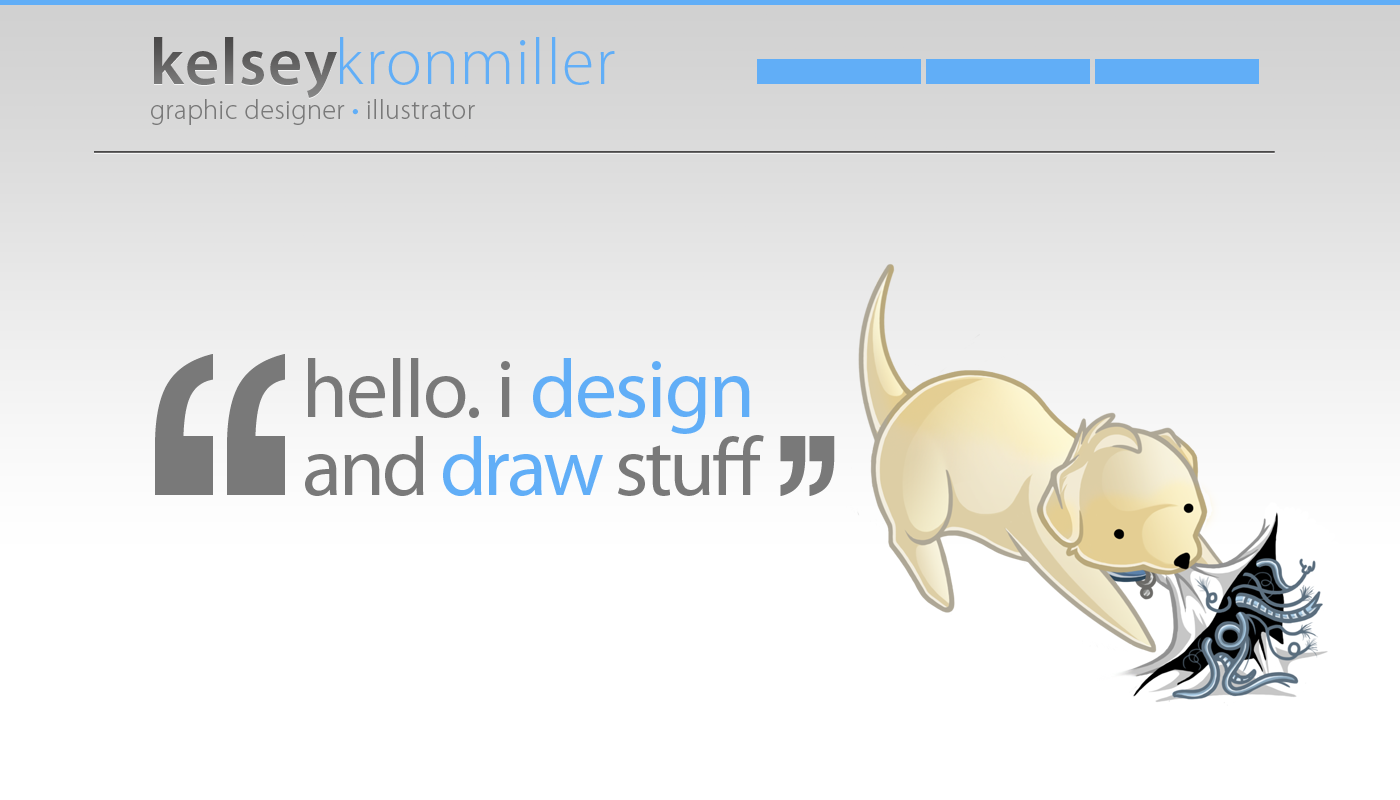
This is LOVELY! My webdesign teacher would totally be blown away. Nice composition, I love that the fonts are big. Will the colored words be links to other parts of your portfolio?
ReplyDeleteAfter seeing this, I am totally going to redesign my website.
Thank you!! Web design is actually something I really love to do and probably my favorite thing about graphic design.
ReplyDeleteThe colored words are just actually for show -- they're to emphasize what I do. Just a little design trick I like to use C:
Great to see my work is inspiring! I'll be posting an updated version of it later tonight or tomorrow because I've been changing things around a bit.